
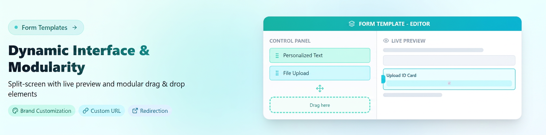
The new version replaces the old static form with a "Split-Screen" interface, emphasizing visual customization and structural flexibility.
I. Interface and User Experience (UI/UX)
- Split-Screen Structure: The screen is divided into two distinct zones:
- Control Panel (Left): Centralizes all settings, from section activation to design elements. Menus are collapsible for clean navigation.
- Live Preview (Right): Any change made on the left is instantly reflected on the right.
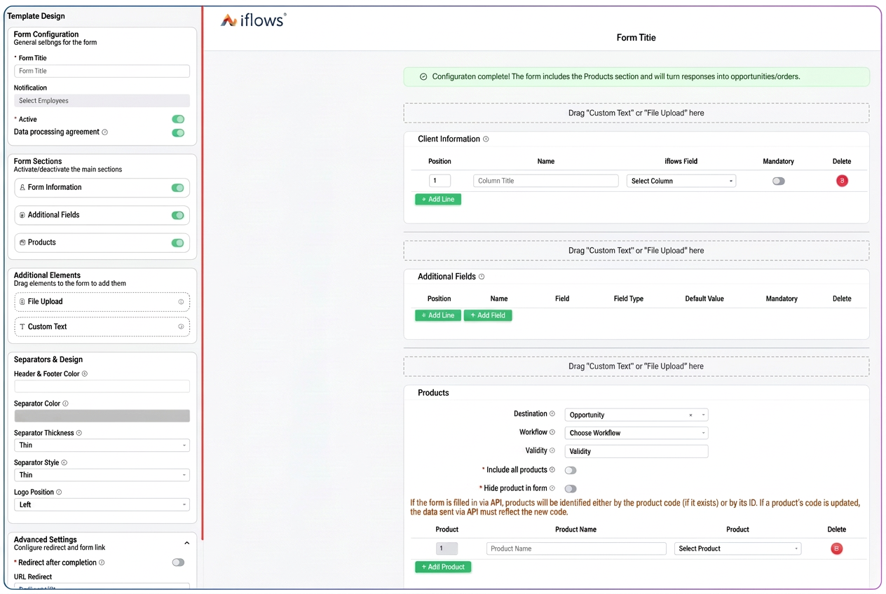
- Final Preview: A dedicated button has been added to simulate the exact customer experience before publishing.
II. Modular Elements and Drag & Drop
The form structure is no longer rigid. We have introduced the concept of "Additional Elements" that can be placed anywhere in the form:
- Drag & Drop Mechanism: Elements can be dragged from the menu and placed in any area of the form (between standard sections).
- Custom Text: A complex text editor (Rich Text) that allows adding instructions, welcome messages, text formatting (bold, colors, sizes), and even images.
- File Upload: The document upload area is no longer fixed. It can be moved anywhere in the form and, additionally, its title and description can be edited (e.g.: "Upload your I.D. here").
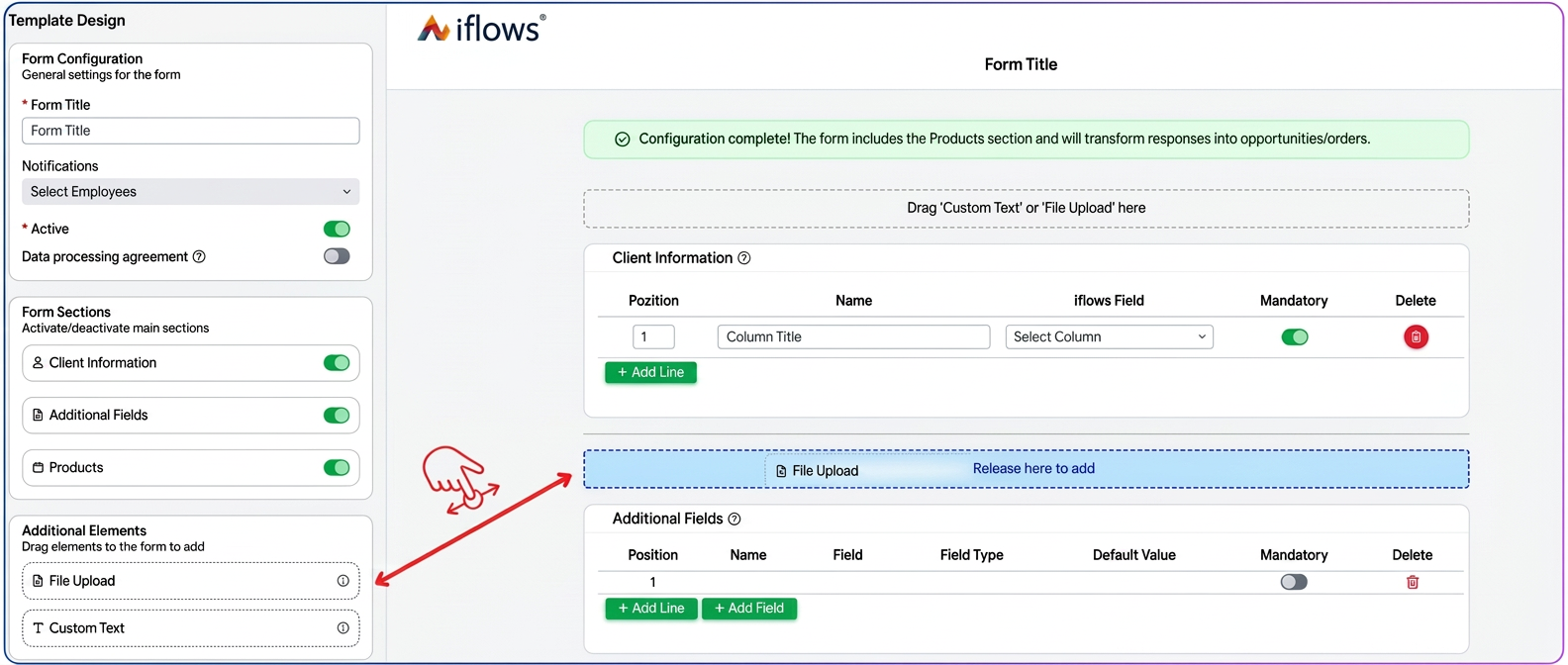
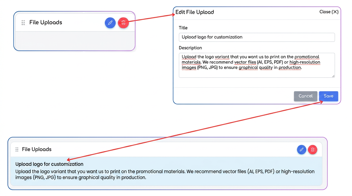
Editing Added Elements (Text / File Upload):
After placing an element in the form (text block or file upload block), each component can be configured individually.
In the top right part of each element, the Edit icon (blue pencil) appears. By accessing it, you can define:
• Element Title – for example:
– „Add LOGO”
– „Upload identity card”
– „Additional request details”
• Description / User Instructions – auxiliary text explaining what needs to be entered or uploaded, useful for operational clarifications (e.g.: „Upload the Identity Card in PDF format to finalize the request"). In the case of the File Upload element, the message displayed in the form can be fully updated so that the user understands exactly which file is required.
This approach allows for the customization of each block based on the form's context, without limitations imposed by a pre-established structure.
III. Design and Visual Identity
Forms can now be fully aligned with your company's brand:
- Color Customization: Specific colors can be defined for the Header, Footer, and Separators.
- Logo Positioning: Control over logo alignment in the header (Left, Center, Right).
- Separator Styling: Control over the lines dividing sections (thickness, solid/dotted line style).
IV. Terminological Clarity and Logic
We have renamed sections to eliminate confusion from the previous version:
- "Opportunity" → becomes "Products": More clearly reflects the purpose of the section (adding products to the cart).
- "Client" & "Client Information" → become "Client Information" & "Additional Fields": A clear distinction between standard contact data and customized fields.
- Validation Logic: The system now displays contextual warnings:
- Green Message: Complete configuration (the response generates an opportunity).
- Orange Message: If the "Products" section is deactivated, the system warns that the response will only be recorded without creating a commercial opportunity.
V. Advanced Settings
- Custom URL (Slug): The ability to customize the form link to be easy to remember (e.g.: .../registration-form).
- Automatic Redirection: Option to automatically send the client to a specific web page (e.g.: Company website or a "Thank You" page) immediately after completing the form.